The shape of the CMS to come
In this article I express my vision about the future of Content Management Systems. I think that CMSs haven't yet taken advantage of the convergence between Code and Design that we are witnessing in the web development world.
Quite the opposite, the separation of concerns between frontend and backend, which developers love, leads to a worse user experience for content editors.
I think that now's the time for this to change.
Three players
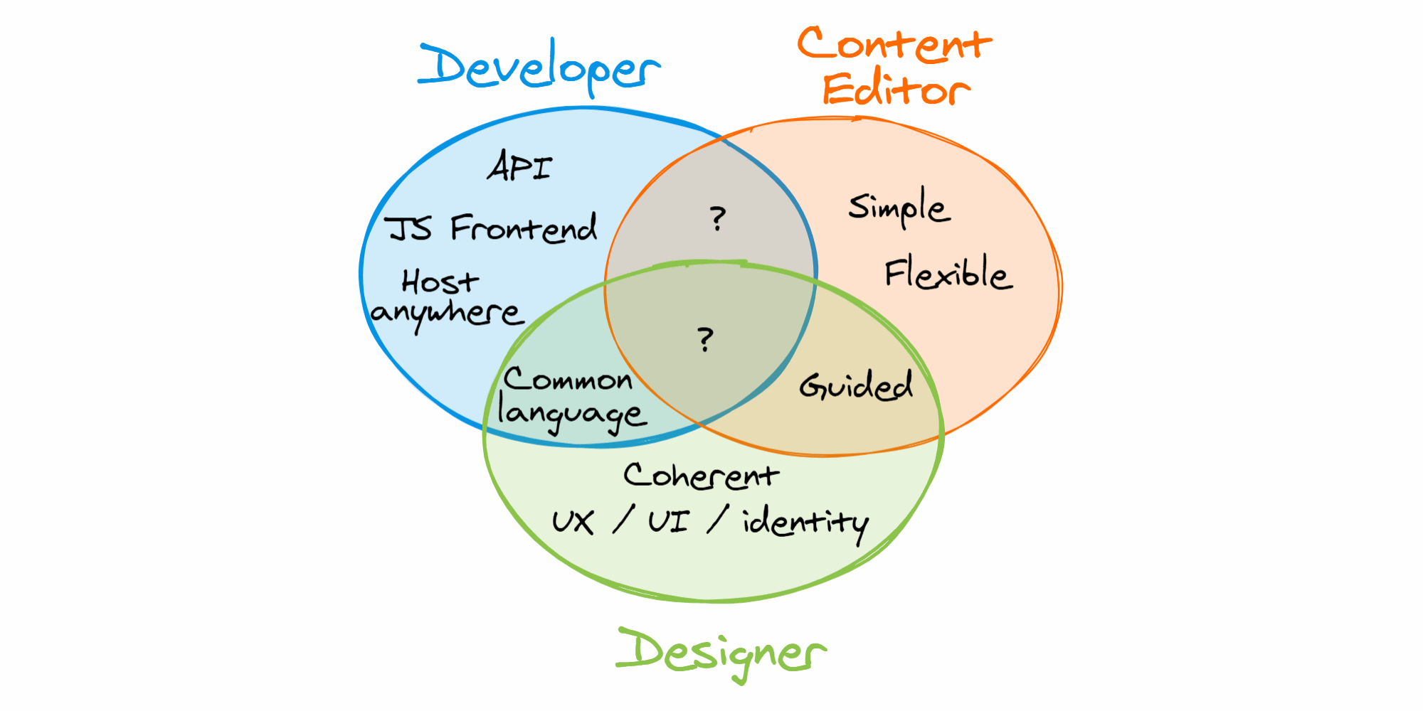
Three kind of people are involved in the adoption and use of a CMS: Content editors, Designers and Developers. These people represent the core parts of a CMS: the content, its presentation and the infrastructure to deliver it. A great CMS today needs to satisfy the requirements of all of them.
Let’s see what these requirements are.
CMS requirements
The Content editor’s dream
For the content editor, the CMS should be simple to use, flexible (freedom in content creation), but should also give a sort of “guided” editing experience to avoid repetition and errors.
The Developer’s dream
Developers love the separation of concerns given by APIs on the backend and a modern stack frontend. The freedom to host the website anywhere is a plus, too.
The Designer’s dream
Designers look for a way to enforce a coherent UX / UI / brand identity. This leads to the desire to speak a common language with developers and have a set of rules that prevents content editors from breaking the design.

Current solutions
The Content editor’s tool: WYSIWYG
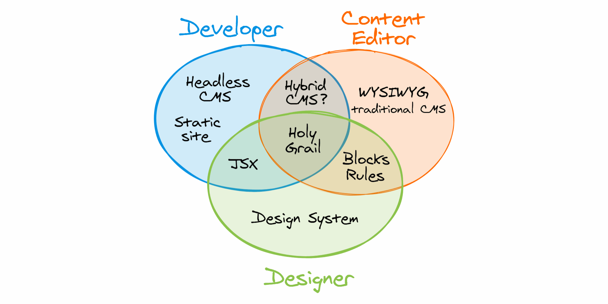
Traditional CMSs have a great feature for content editors: the WYSIWYG editing. Seeing in real time how the content will be visible on the frontend is a great feature. With traditional CMSs like Wordpress, typically this feature comes with the drawback of too much power. With a blank WYSIWYG page, editors can do whatever they want, so the brand identity may suffer. As soon as you try to impose rules (for example using ACF custom post types in Wordpress) you suddenly loose the WYSIWYG ability and you are back to gray forms.
The front-end developer’s tool: Headless CMSs
A headless CMS takes care of the “back-end” side of a CMS, providing the database, the APIs and often the web interface to edit content. APIs provide the separation of concerns between the backend and the frontend that developers love, because REST (or GraphQL) APIs are frontend agnostic.
…with a JS frontend
Using a Headless CMS, front-end developers have a ready-to-use backend, so they are free to create the front-end site with the tool they love, in particular using a Javascript framework like React, Vue or Angular.
Two technologies allow to have great performance and SEO friendliness with Single Page Applications: Server Side Rendering (SSR) and Static Site Generation (SSG).
Static websites
In particular, I think that Static Site Generation is very promising.
Static websites are:
- Really fast (no DB queries at runtime, smart content preload, distribution via CDN)
- Easy to host (on a cloud platform like Netlify or Zeit Now you can often stay inside the free tier)
- Robust (they don’t need a complex infrastructure and what there’s not doesn’t break)
- Secure (they offer a minimal attack surface)
WYSIWYG is gone with the Head
This separation of concerns between content and its presentation, which is great for developers, kills the WYSIWYG editing interface that content editors love. The content creation interface provided by the headless CMS, in fact, knows nothing about how the content will be formatted by the frontend. The result is a worse user experience for the editors. There are other problems, too, like having links from a resource to another inside a text, since on the frontend, the internal links should be replaced with framework specific tags to use a push-history based client-side router.
The Designer’s tool: Design system
A design system (designers please forgive my simplified definition) is a set of visual components, rules and resources that helps keeping a coherent brand identity and user experience.
So, to deploy a design system in a CMS we need to:
- Define a set of visual components shared with the Developers
- Enforce the correct use of this components (blocks) by Editors
JSX as a common language?
I think that the best choice today for a common language shared between Developers and Designers to define visual components is JSX. It is very similar to HTML but much more expressive. I may have a bias toward JSX because I love React, but you can use JSX with Vue, too. Maybe in the future the best choice will be the standardized Web components, but today I’d bet on JSX. JSX props are also a great way to limit the Editors interface and set rules on what can or cannot be done with a component.
Hybrid CMS: a false solution
We saw that with a headless CMS we loose one of the big win of a traditional CMS, which is the ability to edit content with a WYSIWYG editor. Hybrid CMSs try to solve this problem by proposing a sort of traditional CMS which exposes APIs too, as Wordpress with REST APIs does. In this way the provided frontend is optional. The reality is that, based on how you use it, you either have the WYSIWYG editing or the APIs, but not both at once. In practice I think that the existing hybrid CMSs wink more at the editors, as they usually are on the “no code” side, providing just an API sugar pill for developers, which won’t be used on the websites without loosing the benefits of the hybrid approach.

A shared schema
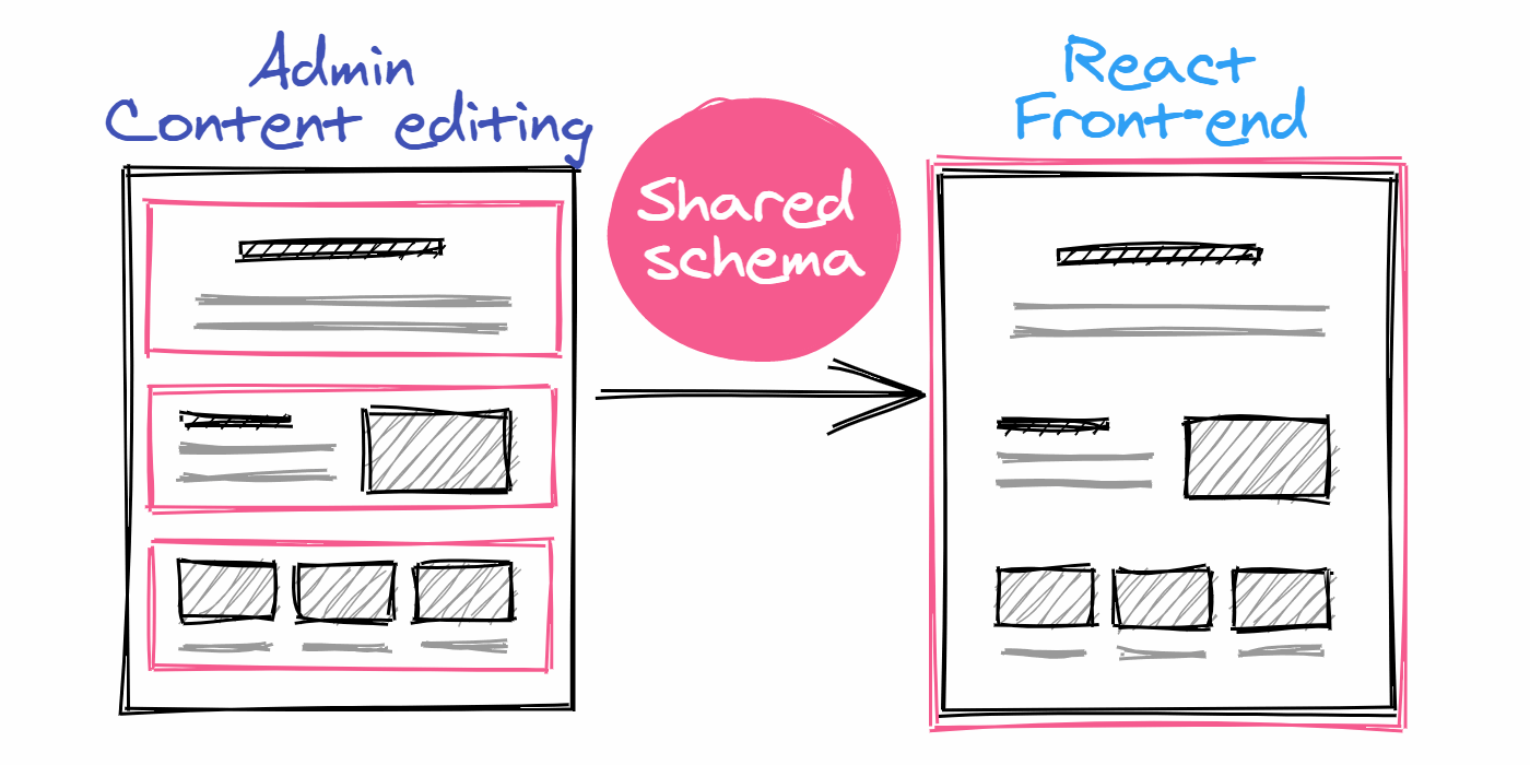
I think that the key is a shared schema between the editing interface and the frontend.

This schema is a set of web components and rules created by Designers and Developers. I think this components will be defined in JSX, so that the rules may take advantage of the components' “props”. The CMS will provide a way to WYSIWYG edit part of this content, with some props (like image ALT-text or background color) edited “off-canvas”. Any choice the content editor will make should be easy and guided, with a limited (but complete) set of available options. In this way the APIs will just return the JSON content of an entity. The frontend, using a library provided by the CMS and the shared set of rules / components, will simply render the exactly same interface that the content editor saw in the editing area.
The first brick
- Good news: we are trying to create just this kind of CMS: its name will be React Bricks :)
- Bad news: it’s a hard task.
- But: we firmly believe in this vision, we are excited by the project and we almost have a prototype in place.
What are the hard tasks?
The first one is the components and schema definition: we’d like to have it edited from the admin interface, by user with Designer or Developer role. But it’s not simple: we’d need to rebuild something like Code Sandbox to let the users use also external dependencies in their block components. The first prototype will be a create-react-app based project to be cloned, which is used to create the content editing dashboard. In this project you will define and test components and schema.
The second one is the way to share the schema, blocks and styles between the content editing interface and the frontend. I can think of 3 ways:
- Copy and paste code from the admin project to the frontend
- Have a npm (or our registry) repository
- Share it via the CMS database
We’ll start with the first solution. Our target is implementing the third one.
Update Feb 12, 2020
I solved the problem in a completely new way: the admin and the front-end are just the same Next.js or Gatsby project! (/admin) ??
The third hard task is decoupling the CSS styles between the admin interface and the edited content. To start, we’ll embrace Tailwind CSS for both React Bricks and the content components. We’ll overcome this limitation in the following releases.
Update Feb 5, 2020
I solved the CSS decoupling problem by using React portals! ?
While we are working hard to finish the prototype and a complete demo, please, let me know what you think of my vision.
Thank you for your time and... stay tuned to receive updates on React Bricks!